Enhancing Survey Profiler Engagement on Freecash
Users must complete a profile onboarding process before accessing surveys. This onboarding originally included 17 questions about the user. The goal was to create an internal profile to ensure users received relevant surveys. However, until users completed the onboarding, they wouldn't see any available surveys.
Duration
Sep 2024 - Dec 2024
Role
Sr. Product Designer
Team
Problem Statement
Freecash requires users to complete a 17-question profile onboarding before accessing surveys. This helps match them with relevant surveys based on demographics like age, income, and employment status. However, we identified two major issues:
Impact
83%
220%
38.5K
23%
Key Challenges
Low Start Rate: Only 30% of users who visited the Surveys section began the profiler onboarding. High Drop-Off Rate: Of those who started, only 40% completed the full flow, meaning just 12,000 out of 100,000 users successfully finished the profiler. Our goal was to uncover the reasons behind these drop-offs and implement solutions to increase both initiation and completion rates.

Survey profiler drop-off funnel graph showing that from 100K users visiting the survey feature, just 12K completed the profiler (12% completetion).
Research & Key Insights
Through data analysis and user session recordings in **Amplitude**, we discovered critical friction points: Lack of Visibility: The survey section on the “Earn” page didn’t stand out. Users scrolled past it without realizing its importance. Poor Communication: We didn’t clearly explain why completing the profiler was valuable for users. Lengthy & Tedious Process: 17 questions felt overwhelming, leading to high drop-off rates. Mobile Usability Issues: The "NEXT" CTA often wasn’t visible due to long answer lists, leaving users stuck and unsure how to proceed.
Solution
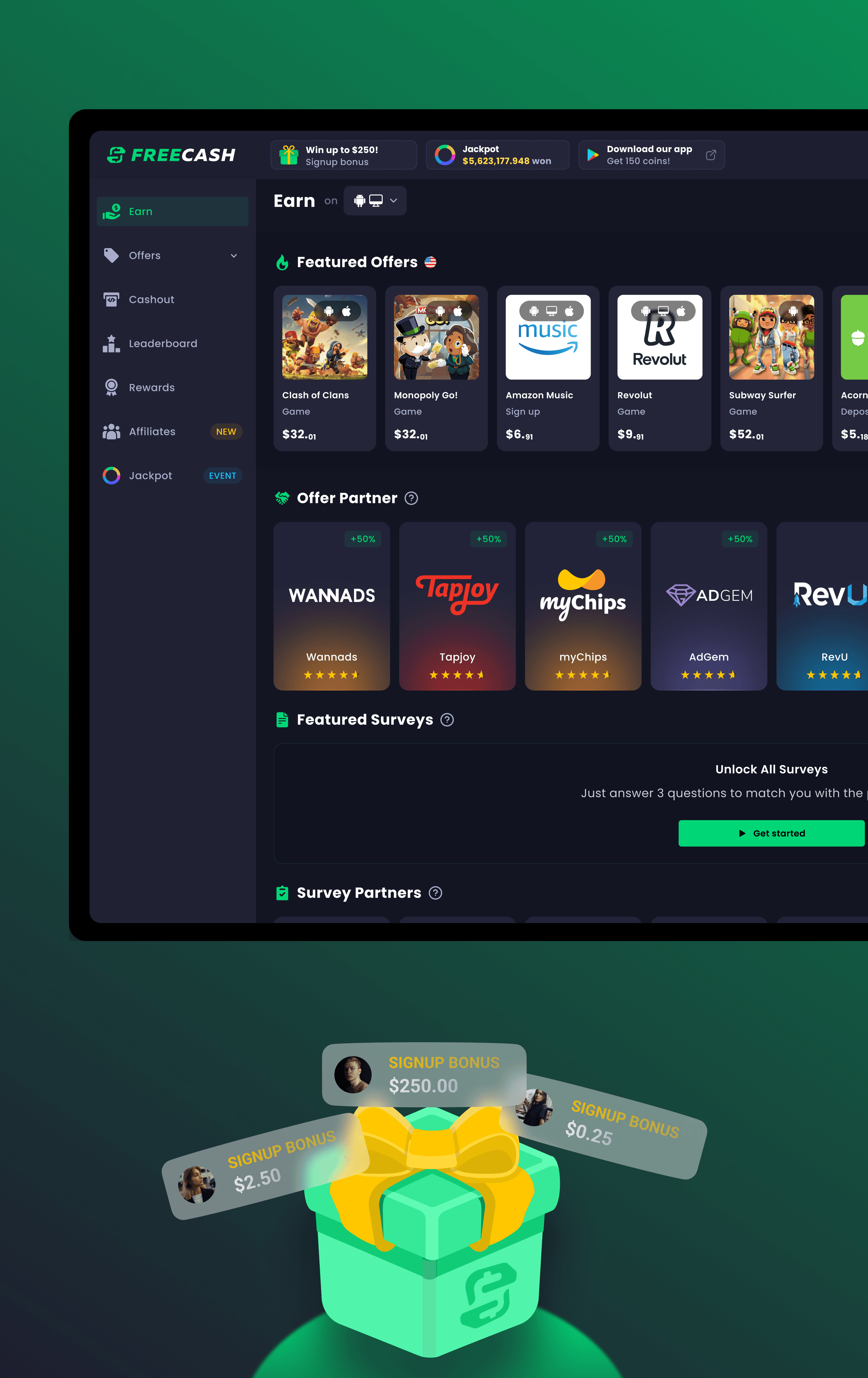
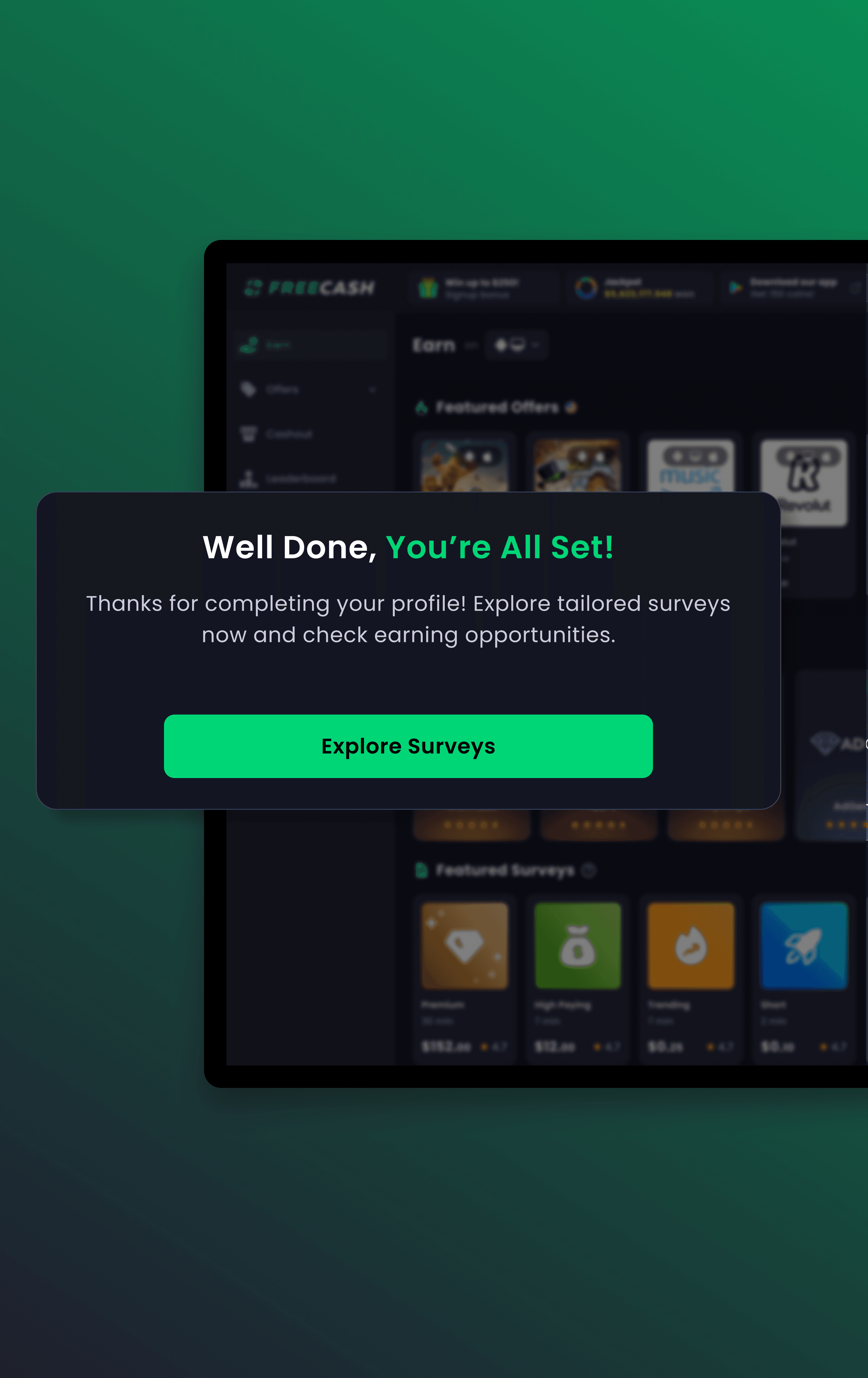
With these insights, we redesigned the survey onboarding experience with a clear focus on: Enhancing Visibility on the Earn Page: - Removed unnecessary distractions (e.g., blurred survey cards). - Added a bold header: “Unlock All Surveys.” - Created a clear subheading: "Just answer 7 questions to match you with the perfect surveys.” - Introduced a pulse animation to draw user attention to the CTA. Streamlining the Onboarding Flow: - Reduced questions from 17 to 7, keeping only essential data points. - Implemented a modern, clean UI** with a step-based progress bar to show completion status. - Ensured sticky CTAs on mobile so users could always see how to proceed, regardless of long answer options. - Added a Success screen post-completion, reassuring users they now have access to surveys. - Redirected users back to the survey section with a clear “Explore Surveys” CTA.

Lo-fidelity based on user feedback and stakeholders.
Handover documentation example. Using chakra UI as design system

Pulse animation created to enhance the interaction with the component.


Takeaways
User attention is key — if an important feature isn’t visible, users won’t engage. Reducing friction improves completion rates —shorter, clearer onboarding drives better results. Mobile-first design matters — small usability tweaks can lead to significant impact. This project proved that thoughtful UX enhancements can create measurable business impact, reinforcing the value of user-centered design in driving engagement and retention."
